What has changed
We have made some changes in the different tabs at the Subject level Dashboards to improve the reading of some of the graphs.
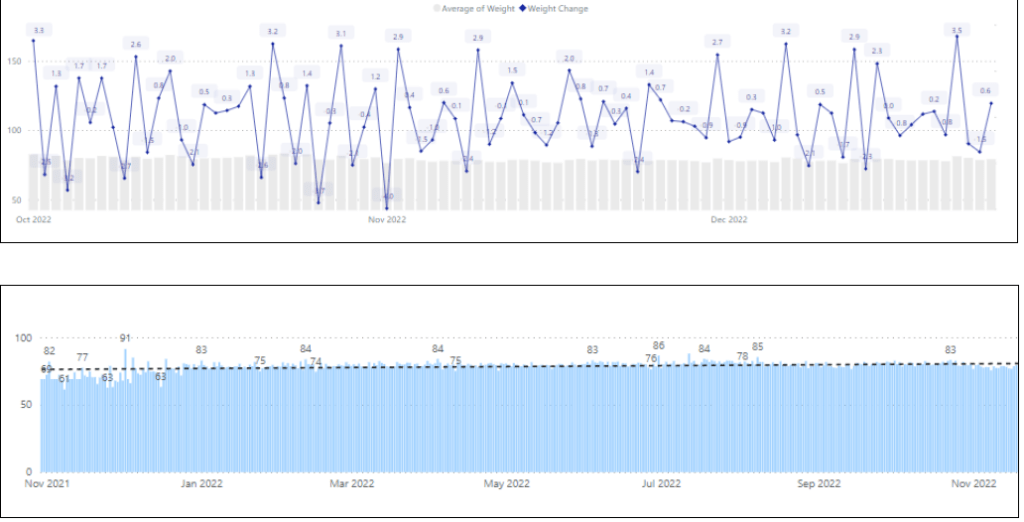
Weight: We added a trend line on the weight plot and removed the weight change percentage line.
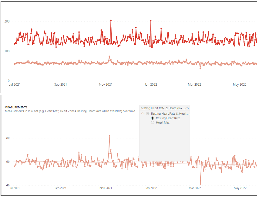
Heart rate:Added the option to isolate either the max heart rate or resting heart rate in order to identify easier a trend.
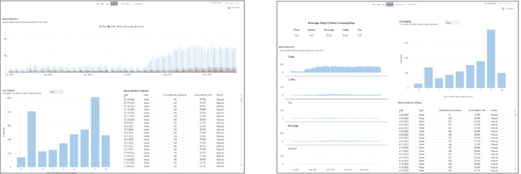
Liquids:Changed the clustered bar chart to 5 different charts. This decision makes data more readable, and lets you identify trends easier than before. Also added the average consumption per liquid category for the selected period. This addition helps to understand the habits of a selected patient in a glance.
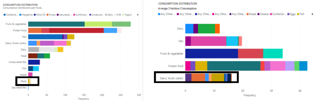
Nutrition:Changed the clustered bar chart to single bar charts. (One per food this modification makes the report more readable and it is easier to identify trends.) Also in the food category frequency we changed the Y axis to show only root categories and not sub categories also (Starcy foods instead of pasta). We also normalized frequency by month, instead of a total “count” of each category.The advantage is that we can understand how many times per month, the subject consumes a particular category, without calculating it manually.


Medication Adherence: We added the overall medication adherence per medication. Each bar can be also used to filter the table above. The update provides easier examination of patient’s adherence.

How it affects you
We hope to offer an easier reading to the data collected from the application.